HOME | DD
 TRice01 — Kamen Rider Double Romanized Logo

Published: 2011-12-23 01:22:07 +0000 UTC; Views: 6613; Favourites: 61; Downloads: 151
Redirect to original
Description
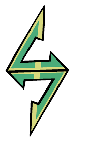
As requested by DinocoAiko002 (though I had this made up earlier)Below the original Japanese logo, is my Romanized logo.
The tricky bit on this one was creating the glow effect (outerglow wasn't working properly) as well as applying the masking layer on the green half of the "W".
A design choice I made was to go with spelling out "Double" instead of using the more commonly accepted "W". I thought having the two "W's" would have been redundant. Also, if you look on the original logo they have, "Kamen Rider Double" spelled out in English characters. This is similar to the design choice made in my Kamen Rider Blade logo where I put a spade character in the background instead of repeating the world "Blade".
The text in the green section is the list of Riders from the bottom of the Wikipedia page on Kamen Rider.
Media is full vectors in Adobe Illustrator CS4.
Kamen Rider Double is the property of Toei
Related content






Comments: 19


That looks so awesome.
The only critique I would have given would have been to make "DOUBLE" a little smaller then put in a slight diagonal tilt that goes downward the further right it goes. At least, that's what I think the katakana for "Double" was trying to accomplish in the Japanese logo, but then again, I might not know enough about the language to know what I'm talking about.

👍: 0 ⏩: 1

Thanks for the critique! If I ever revisit this project I may look into it. The main thing you have to keep in mind though is that I want the letters to match the feel of the logo, but also be readable. It looks like katakana can be a lot more flexible in this respect than our letters. I think I remember having to reluctantly stretch the "Double" part to make it more readable.
👍: 0 ⏩: 1
Our lettering system is different, this is true, but even our language does have some flexibility as far as word placement.
Still, you make awesome Romanized logos. It's something I have wanted to go and started on, but I've been holding back on all my various creations until I felt it was a perfect match to the Japanese counterpart. So keep up the good work, and thanks for inspiring me to keep trying! Can't wait to see more of your work some day.
👍: 0 ⏩: 1
The nice thing with doing these logo "recreations" is that it forces you to think about how they did it. And in the process you pick up new tricks and techniques.
Thank YOU for inspiring me to keep creating and posting.
👍: 0 ⏩: 1
Yes, it does. Recreating great logos like these, regardless of the language, can always challenge your thought process on how to make eye-catching designs.
And no problem! I look forward to your future creations.
👍: 0 ⏩: 0

I was wondering if you had a version sans text I could use in an avatar. Just the green/black W.
👍: 0 ⏩: 1
I may be able to help you with that. What size and file format do you need it in?
👍: 0 ⏩: 1
Any size, as it's going to be 300x300. PNG with BG transparent is preferable. Thanks.
👍: 0 ⏩: 2
Sent you a note with the file attached. let me know if it works.
👍: 0 ⏩: 0


can i request for kiva and fourze logo? BTW its match with the real logo
👍: 0 ⏩: 1
I actually have done the Kiva logo, but just haven't had a chance to upload it yet. I do plan on doing Fourze after I get some of the earlier logos done.
👍: 0 ⏩: 0

These would make a great show in Amercia, if they do it right.
👍: 0 ⏩: 1

don't expect them to keep certain things like the windscale clothing. instead, they'll just wear normal non-branded windscale stuff.
👍: 0 ⏩: 1
I know, and I don't care about that.
👍: 0 ⏩: 0