HOME | DD
 unit-zero — Melt Down

Published: 2003-06-14 08:00:47 +0000 UTC; Views: 674; Favourites: 3; Downloads: 123
Redirect to original
Description
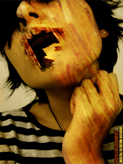
i was going for more of a fire look to this render and i really like how it turned outc&c welcome
Related content






Comments: 13

VERY nice. maybe a little work on the 2D on the left, and a different font on the right. it kinda takes away from that woaaaah-duuuuude vibe it gives off. 
👍: 0 ⏩: 0

thanx 4 visiting my page i realy like your wp this is the kind of stuff i would like to aspire to do in the future ill keep looking
thanx c-a-storm
👍: 0 ⏩: 0

Awsome, i l0ve it. If there is anything that could be better, its that you could smooth out the edges a little. And the res* thing. yeah.
👍: 0 ⏩: 0


Love the fiery color, it looks just like green-armani's mat for "vagrant" which I've been trying to figure out how he created.....looks like you did....lol....
👍: 0 ⏩: 0


Very nice color combination. It's Bryce, right? The 3d work is very nice too and the 2d isn't overdone, like some other wallpapers.
👍: 0 ⏩: 0

Wow, I really like these colors. That Brownish red colors with the orange is really good.
👍: 0 ⏩: 0

Sweet, dood, ur improving fast
Although is this meant to be a wp?, if so dimensions are badong.
I like the colours in this piece, and the composition too..Its a little bit jaggy round some of the edges, but that doesn't matter too much..
I reckon needs more 2D tho, but what you have done seems to fit quite tidely, anyway its impressive my friend..
Ill give it a +fav. ^_^
👍: 0 ⏩: 0

not bad...needs sum finework....but the render looks cool..!!!
👍: 0 ⏩: 0

