HOME | DD
 vts31 — client work 23
Published: 2002-04-17 01:29:13 +0000 UTC; Views: 1002; Favourites: 1; Downloads: 177
Redirect to original
Description
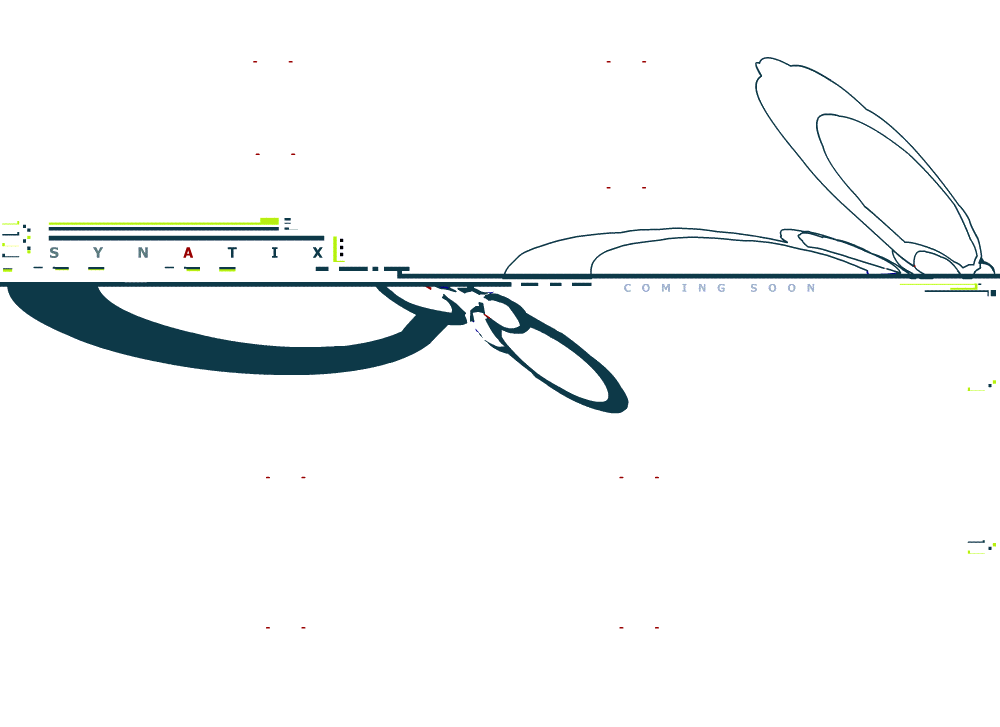
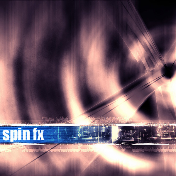
another client image. Made to his descriptions. Abstract but minimal and semi trendy grungy kinda. lol. well its ok...humm and this my 105th deviation. i think like 100 are high quality and 5 blow.Related content










Comments: 9

I dont believe in criticizing client work, because it almost never comes out how you want it to. It looks good on my end. especially those colors.
👍: 0 ⏩: 0

nice and jeez, you got a lot of deviations
-----
May the Force be with you!
Jedeye.com http://jedeye.com
👍: 0 ⏩: 0

Unfortunately, my comment follows the trend. :\ I liked the other piece better. However this one is good as well. My suggestions resemble Pris Chan's suggestions. Good job nonetheless. Like your work man, keep it up.
👍: 0 ⏩: 0

this is cool too but I like the other piece better IMHO
-----
click it - http://12.24.88.28/rebecca
👍: 0 ⏩: 0

cool, but i would probably take off those small marks and make the strokes heavier.
👍: 0 ⏩: 0


pretty cool..but as others say i think it should be smooth..just isnt lookin too good with the other 2d.the idea is cool though =] just needs some smoothness added to those curves..i like the colors too..very unique
👍: 0 ⏩: 0

yah it does looks a little choppy. cool idea though
-----
angelsfaithDOTtk::: http://www.angelsfaith.tk
👍: 0 ⏩: 0
