HOME | DD
 weaponzero — DA Logo - Weze

Published: 2002-02-17 18:12:28 +0000 UTC; Views: 983; Favourites: 3; Downloads: 48
Redirect to original
Description
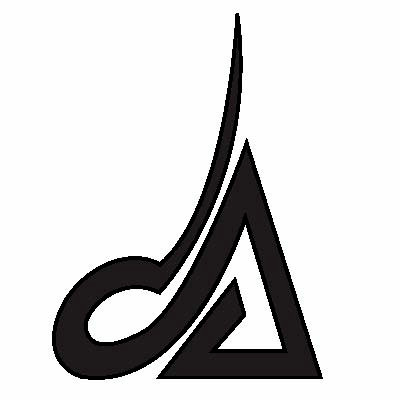
Just realized it must have gotten lost in one of the times my deviations were lost.. so i decided to resubmit.I might turn this into a header since my old one looks crappy in the stupid sidebars on the header now :/
Yea so.. wheeeeeeeeeeeeee?
Related content











Comments: 5


neat looking logo. too bad we didnt pick it.
-----
https://www.deviantart.com/help/faq.php http://www.jarkolicious.com
👍: 0 ⏩: 0

Yeah.. that is a pretty spiffy looking logo. I love the sorta.. spiralesque shape it resembles. And the use of negative space looks cool in a logo like this
-----
~fuzzydemon
The pen is mightier than the sword, unless the person youre fighting actually has a sword.
👍: 0 ⏩: 0

THats realy cool
-----
-------------------------------------
http://www.drominixstudios.com
Monere salvete nautas debemus
Salvete, Nautae!
Im just a carbon based biped trying to make his way!
evE®¥†hÏÑg ¡$ Ñø‡H±ñG
👍: 0 ⏩: 0