HOME | DD
 zero7 — 07tatt002

Published: 2002-06-25 15:23:52 +0000 UTC; Views: 509; Favourites: 4; Downloads: 108
Redirect to original
Description
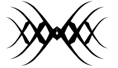
another tattoo design. the more i look at this one, the more i like it, but i still think theres things to be done to improve it. any suggestions you might have would be greatly appreciatedRelated content




Comments: 5

I commented on this on your page but I think this design is awesome...reminds me of a bat or something
👍: 0 ⏩: 0

A very nicely drawn tattoo, so many differnt things there, a bat, dragon, vampire wings, a deamon, a face. Sit and look at it long enough I could problably fand even more. Great work.
👍: 0 ⏩: 0

Another cool design. The outer most part (far left and right) that splits in two and tapers off, looks a little 'weak'. The very thin ends of the shapes seem to droop.
Maybe make those outer wings bigger and keep them as just one sharp shape which still goes to a point.
Hope you understood that. :hungry:
👍: 0 ⏩: 0

HMOG!!! Great work, mate.
It´d be great on the lower back or on the arm (near the shoulder).
👍: 0 ⏩: 0

i love this one...If you improve it even more...I want to use it, is that cool?
👍: 0 ⏩: 0