HOME | DD
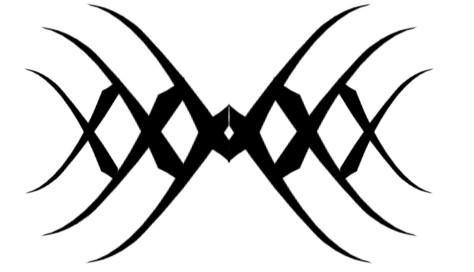
 zero7 — 07tatt002v2

Published: 2002-06-26 13:52:42 +0000 UTC; Views: 344; Favourites: 2; Downloads: 32
Redirect to original
Description
just a revision of 07tatt002Related content






Comments: 9

Err... I was at Vividimage's house when I made that comment, so his comment was really mine. Sorry about that.
👍: 0 ⏩: 0

The things on the top left and the top right seem to just throw it off. And also, it seems like a rectangle on top of a little beam... Just seems to heavy on top for some reason. Don't get me wrong, it's very nice, it just seems to be off balance for some reason... I just got a second opinion from a friend and he said it looks balanced to him, so maybe it's just me... Sorry for the confusion.
👍: 0 ⏩: 0
This doesn't seem very "balanced" to me.... Still cool though.
👍: 0 ⏩: 0


Great design it is easy to see the progression from the original, I like it alot. Keep up the great work.
👍: 0 ⏩: 0

That's so gorgeous... I'm usually not into tatoos that are straight black like that, but I really like that one.
👍: 0 ⏩: 0

thats so awesome. man... i would want that, like, right on my back, like lower back. thats just so cool!!! damn!!! you're amazing!
👍: 0 ⏩: 0