HOME | DD
 ZeroElements — Traditional Pose
[NSFW]
ZeroElements — Traditional Pose
[NSFW]

Published: 2008-06-18 01:09:03 +0000 UTC; Views: 849; Favourites: 13; Downloads: 0
Redirect to original
Description
2007Related content


Comments: 36

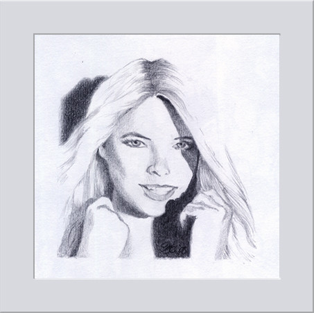
I love the wonderful light/shadow borderline in this body,you are a drawing master of soft classic anatomy.
👍: 0 ⏩: 1

I am honored, thank you.
👍: 0 ⏩: 0

Hey Paul,
How come no one draws nipples as they appear most of the time. Mine aren't symetrical 
👍: 0 ⏩: 1
i don't think symmetrical nipples really exist. i think i remember some scientific study saying that one half of the body is always a little out of proportion to the other... slightly. in some cases probably barely noticeable.
👍: 0 ⏩: 1
in some other cases , show stopping noticeable....
👍: 0 ⏩: 1
umm yes it can be more intense then others. i've heard of completely disproportionate breasts, like one is rather noticeably bigger then the other.
👍: 0 ⏩: 1
I personally enjoy what most people consider imperfect. Dunno why, seems more human to me.
👍: 0 ⏩: 1
that's good though. imperfections can make the person that much more appealing and interesting.

👍: 0 ⏩: 1
They are nice seniments that people share one on one but it's not what most share in public; unfortunately the individual isn't the problem; it's the collective--even in matters of the heart and attraction.
👍: 0 ⏩: 1
yeah i can see that. good thought on that.
👍: 0 ⏩: 1

👍: 0 ⏩: 1


👍: 0 ⏩: 1

The lighting you've created here is amazing!
You also really know how to capture the landscape of a woman... You must be a bit of a ladies man

👍: 0 ⏩: 1
thank you for the critique.
i'm as much of a ladies man i can be without negative side effects of manipulation.


👍: 0 ⏩: 1
haha!... An eternal struggle not limited to the male gender but perhaps only the intelligent...

👍: 0 ⏩: 1
yeah the intelligent with a conscience, considering there's sociopaths out there.
👍: 0 ⏩: 0

I really love the consistency of the lighting. Glad to see someone who's taken the time to check that it all lines up
The lighting on her breasts is especially well done.
👍: 0 ⏩: 1
Thanks! I take great care on the female form. Thanks for the recognition.
👍: 0 ⏩: 0

The shades and highlights are exquisitely done! Very professional. My only complaint is that I wish it was a little more defined. Very well done though!
👍: 0 ⏩: 1
defined in line?
i'm not sure what you mean exactly by defined.
thanks for the good words
👍: 0 ⏩: 1
Like the texture of the pencil looks like it was on a desk? Maybe define it a tad more or finger blur.
And no problem
👍: 0 ⏩: 1
The texture you see is the paper in reaction to a .5 mechanical pencil. This piece's original size is probably 2 1/2inches by 7inches. I can see what you are saying, but you are seeing the fine texture from the paper on this. 
I do like your critique though. You got into some detail there.

👍: 0 ⏩: 1
I'm impressed and have no idea... I draw rarely in pencil. I use the finger smudge xD 
👍: 0 ⏩: 1


Gee man, you've got a good understanding of anatomy. That's pretty darned good. Really good lines and reading of flesh and muscle masses.
(Unfortunately can't 

👍: 0 ⏩: 1
Hey thanks allot man! You think it deserves a mature label? As a traditional art pose, I didn't think it would need it. Perhaps if it was some girl bending over, showing the whole package with panties on would be a mature label!
👍: 0 ⏩: 1
Well, some people get funny about that sort of thing on here.
👍: 0 ⏩: 1


You're good at krocki-art (dunno if its called that in english) its simply, when you draw bodies. I think it's hard to make all those lines. (And expensive if you go to krocki course) You inspire me to continue practice
👍: 0 ⏩: 1
Awesome man!
I can't wait to see your inspired work! Thanks for the words!

👍: 0 ⏩: 0