HOME | DD
 ziinyu —
dA Piece by Piece : CSS + Box
ziinyu —
dA Piece by Piece : CSS + Box

Published: 2010-11-24 03:55:13 +0000 UTC; Views: 79505; Favourites: 1653; Downloads: 843
Redirect to original
Description
I've been becoming more active in deviantART, so I decided the time had come to contribute a little more to the community, this time in the form of a dA specific tutorial. Please let me know what you think of this, as I have plans to continue the the series. If you need more information, please feel free to ask .
.dA Piece by Piece : CSS + Box [Gruze]
You can simply copy the code that is given in this tutorial, however to fully utilize it a basic understanding of HTML and CSS is necessary (at least knowledge of opening and closing tags and a little bit about class structure).
DeviantART uses a custom made structure, known as "Gruze", to control the modular layout of the site. For the most part, the inner workings of this system remain hidden from users, to be controlled only by the site. But, if you know where to look, and are willing to experiment, many of them can be manipulated to inject elements of dA Style into your widgets.
This tutorial is designed to go over the primary elements that make up the rounded edged box structure seen throughout the site. This code can be used in most places where you can insert text in a text-box (such as journals, widget descriptions, etc.) on your profile page. If the text-box is not editable or has a preview button, it is likely this code will not work (such as in comments).
The generic code for the box is :
As you can see, it's quite a lot of code, and rather complex at that. Some of this is do to the necessity for whitespace (such as indentation and line breaks) to be omitted (go ahead an experiment with what happens if you put each opening and closing tag on different lines). To this end, the cleaned code and its structure is shown above, and we will further talk about intricacies and variants below.
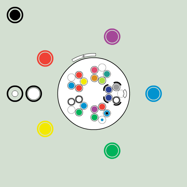
EXTERNAL (Gray)This is the foundation of the box structure, it contains all other elements of the box. While it doesn't have any physical appearance itself (it is transparent, and only serves to position internal and external tags), it is a necessary parent to some of the other classes used in the box.
These tags must be included, containing ALL of the other components to ensure correct behavior.
Some classes may be used outside of the .gr-box class but will likely have different appearances and physical behavior.There are additional classes that can be added to this containing element to give different behavior, try including .gr-genericbox, .gr-configbox, or .gr-headlessbox (each type of widget also has a .gr-[...] class assigned to it, experiment with those for different effects.) There will soon be more on alternate box types in another tutorial.
EDGE (Yellow)The rounded edges of the box are created by a series of classes applied to three spanning tags. They are numbered 1 - 2 - 3 to make an upward curve, and 3 - 2 - 1 to make a downward curve.
The top bar of the round edge, this appears as a horizontal bar, slightly shorter than the width of the box, with transparent sides.
This is the next element of the rounded edge, it appears as a short bar (the outline) with transparent outside. The internal tag creates a light colored bar (giving the rounding an antialiased effect). If this internal tag is omitted, the background color will be the same as that of the BODY section of the box (to allow a smooth transition from that component).
This is the last piece of the rounded edge, it is similar to .gr2 but with a vertical bar instead of a horizontal one. The internal tag creates two small light boxes (for the smoothing). Again, removing the internal tag, will leave the background color the same as that of the BODY component.
As of yet, the .gb and .gb1 currently have no physical appearance, they are used so that user created style-sheets (as used in Premium Journals) can control the lower rounded edge separate from the upper one.
TOP (Red)The top of the box is used to hold the title of the box as well as an icon and a triangle transition glyph. It is lighter in color than the body elements of the box.
This is the containing element of the top of the box. It has a darker border (that matches the outline of the rounded edge) on the left, right, and bottom edges. It sets the internal .gr class to use the same light background as the rest of the TOP component.
This creates the small triangle that descends into the next component. The triangle is absolute positioned relative to the bottom of the component element, it cannot be moved arbitrarily (unless placed within another element). The triangle itself is an image file (quadraforce.gif ) assigned to the background of the tag.
When used inside of the .gr-top class this element has a light background and lighter borders on the left and right edges. This class, appearing in all of the components of the box, is the the primary internal structure. It is here that content (such as text and images), is placed.
This creates an icon from the standard iconset (icons-small-modules.gif ) that assigned to the background of the tag. Whatever is used to replace # determines the icon that is used, the number mapping does not match the order of the icons in the file.
For more information on icons, please see `LostKitten 's 1-50 Custom Box Icon Legend and 51-100 Custom Box Icon Legend guides. The two line breaks are very important to ensure that the icon does not collapse into the next element (shifting its border to the right). Also be aware of the fact that the text in the top area is lighter colored. This is due to the fact that normally the text is included within an tag set, a feature which is disabled from user-made boxes. There are alternate ways to create darker text in the title though (?).
Note how the top component has a border on the bottom edge, but not the top. This allows for the rounded edge to transition smoothly with the upper rounded edge. As an experiment, try replacing the entire upper rounded component with an empty div.gr-top tag, to create a sharp edge with a border.
MIDBODY (Green)This component is not often seen in widgets (most notably, it is located in the donation widget). It has a darker background than the BODY component, but functions in very much the same way.
The containing element of the MIDBODY component, this has a dark border (though lighter than the other components) on the left, right, and bottom edges. It has a relatively dark background (that is seen through the transparent internal .gr element).
When located within a .gr-midbody element, this has a light colored border on the left, right, and bottom edges. It has a transparent background.
BODY (Blue)This is intended to be the final element of the box (it transitions into the lower rounded edge). It is also the primary location for content in the box
The containing element of the BODY component, this has a dark border (though lighter than the other components) on the left and right edges (but not the bottom). It has a mid-tone background (that is seen through the transparent internal .gr element).
When located within a .gr element, this has a light colored border on the top edge. It has a transparent background.
This transparent structure creates text padding within an element. Use the .p and .ppp classes for different amounts of padding.
The beauty of the Gruze system is that it is completely modular. Not only can boxes be embedded within one another, each of the components of the box can be combined in any order and used interchangeably. All you have to be careful of is the end behavior, the top EDGE classes are meant to integrate with the TOP component, while the bottom EDGE classes are meant to integrate with the BODY component. Experiment with adding more internal components and omitting components. Straight edges (instead of round edges) can be created by manipulating empty components (which will span the box, but have only height enough to display their borders). Once you get a feel for the system, it is simply a matter of manipulating it to get the desired effect
.Well, there it is
. I might go back in and add a little bit more about alternate means of combining the various elements. Also as I learn more about the system, I'm sure there will be more tricks I'll want to include. If this well recieved I think I could put one together for other boxes (comments, config, and the like), buttons, alternate iconsets, and other miscellaneous components. After that, perhaps an application of the schematic deconstruction to pages and community interactions in the site ... ?EDIT : 12/1-10 1:47 PM PST
I've compressed the whitespace of the image a bit so that it should read better in deviantART (also replacing some of the colors that were more difficult to read). You should now be able to view it with readable text in normal fullview mode, no download necessary. If you would like to download it, please use the equivalent of "Download Linked File" for your browser. It does not view well embedded full size (3000+ pixels) in browser, too much scrolling is necessary. Instead view it in your local image viewer, so you can resize and navigate as needed
.I'm doing some research on alternate box types and where they work in the site for the next tutorial. After that (or perhaps a little before) will be the buttons tutorial. DeviantART uses many different button types, and most of them are still functional. Learn easy ways to control icons and text in your custom made buttons.
I really appreciate all the support this has gotten recently. If you would like to use this tutorial to make your boxes excellent I don't ask for any credit, these are hacks anyone could find by looking in the right places. However, if you do start experimenting with the system, let me know, I'd love to see what you can create (and likely learn from it too
).EDIT : 12/3-10 2:55 PM PST
So ... I guess this constitutes "well received" then
.Huge thanks to ^ginkgografix who not only chose to feature this piece, but also helped give it a bit of shine through a very helpful critique. I'm going to work on a little follow up tutorial to this one just to incorporate some of the journal specific features of the box.
If you have edits or corrections you would like to contribute to this (particularly tricks to manipulate the box), or are having difficulty getting the code to behave the way you would like, don't hesitate to contact me
.Tools :
1. Safari 5.0.2 (Develop Mode)
2. Adobe InDesign CS4
3. Adobe Photoshop CS4
Inspiration : `LostKitten + $DEVlANT + ^ginkgografix
Music : Faded Paper Figures
Time : 5 hours
Related content








Comments: 202


Thank you! I've been looking for something like this!
👍: 0 ⏩: 0


I've been looking for something like this for 2 months. Thank you
👍: 0 ⏩: 0

How would you go about adding more padding to the sides of a custom box?
So that for example if you div align="right" a test, it doesn't stick right to the edges? Thanks!
👍: 0 ⏩: 0


How can I add a skin to the custom folders of my gallery?
👍: 0 ⏩: 0

Do you know how to move the background over a little bit? o3o
👍: 0 ⏩: 0

Thank you so much for your wonderful tutorials.
👍: 0 ⏩: 0

amazing... O.O but it hurts my eyes to look at. XD
👍: 0 ⏩: 0

Most definitely deserves a fave which I already did God knows when but I am adding a link to this on my tutorial on submitting skins to deviantART since I am updating it now. Great tutorial!
👍: 0 ⏩: 0

nicely done! very easy to follow & understand. you've helped me a lot! i was able to customise my own journal css by following your diagram -- after *hours* of trying to work it out using tutorials i'd found elsewhere. thanks a bunch!
👍: 0 ⏩: 0


Do you know if there is any way to use this to remove borders from the excisting boxes on my frontpage (For example the "featured artwork" or the "newest artwork" boxes)? I know this is possible in the journal, but I have never tried to code one myself, so I havent checked out if it would be possible to use the same technique in a regular box. If you head over to my site you will see that I have created a slight background-change in the two top-left widgets but it is quite hard to notice when the border of the widget surrounds it. If it was possible to remove it would be really cool to test it out.
👍: 0 ⏩: 1

I'm afraid you are out of luck on that one.
DeviantART codes those boxes so that you are allowed to change everything within the border, but the border and any overflow cannot be edited in any way. They give much more flexible control over journals, but for the other elements the have pretty strict regulations. As for your case, perhaps lightening up the diagonal lines a bit would make them more visible?
Also just for future reference, when making a pattern like that, sometimes it's good to create a transparent PNG. In this case, just a grid of white diagonal lines. This way you can overlay it on any background and have it display nicely (it's a little more versatile this way).
👍: 0 ⏩: 1
I thought so. So thanks for answering so quick
Oh, yeah, that sounds like a great idea. But will that work in the art-section of my profile? Will it not let the original art and buttons wich lies underneath shine through?
👍: 0 ⏩: 0

Thanks for this tutorial !
I have question about the colors of the box, is it possible to change them ?
If it's can be, how do it that ?
👍: 0 ⏩: 0

hm. The picture looks very cool but I can't get it to work.
Your many components are kind of confusing
Is there any way you can give me just the raw code with everything together [the midbody, external, top, body, edge, and the standard box?]? That would be very helpful. c;
👍: 0 ⏩: 0
You are very welcome!
I think most of it's sadly inapplicable these days as the default journal skin has changed - but perhaps it's still an interesting coding insight?
👍: 0 ⏩: 1

Yes, it is! I've learned a lot from it!
👍: 0 ⏩: 1
Thank you! I'm so glad to hear it.
👍: 0 ⏩: 1


WTF!? DX I HAVE NO IDEA WHAT THIS IS! 
👍: 0 ⏩: 1
It's a sort of representation of how the HTML and CSS in the devART journals works! It's for people who want to make their own journal skins but within the design of the existing ones (for color swapping, size changing, kinds-of-things). It's sort of like hacking the existing design elements to create our own custom designs!
Of course most of it doesn't apply directly anymore as devART has changed the basic journal structure - so it's more an artifact of how things used to work.

👍: 0 ⏩: 0
It's kind of tricky these days - especially as devART has changed the basic journal structure so there aren't too many examples of it around anymore. Once upon a time though it was a tool for hacking the existing journal structure into something retaining the old design elements but with a style all your own!
👍: 0 ⏩: 1

Yeah, i got premium and im like 'Yay, i'm gonna make a journal skin! Now WTF do i do?' lol.
Maybe they should have kept it like that? Sounds like it would have been easier.
👍: 0 ⏩: 1
Well I haven't taken a look at the new journal setup yet, but it seems pretty clean!
It's probably actually easier to code than the old ones (which were pretty complex, hence the need for a guide like this). Back in the day I used to have the names of deviants and deviations for guidelines and tutorials - but these days I'm a little out of the loop. 
Best of luck.
👍: 0 ⏩: 1
Ok, i'll try that. Thank you
👍: 0 ⏩: 0

I have no idea what I'm reading, but I think I need it. LOL.
👍: 0 ⏩: 1
Well, the theory behind it is useful, but the journals themselves have changed since I wrote this - so it's not directly applicable anymore.
At any rate, if you have questions about HTML/CSS coding, feel free to ask!
👍: 0 ⏩: 1

I just noticed that you put RBG instead of RGB for the color values.
👍: 0 ⏩: 1
I did a double take when I realized you are totally right!
Looking into it, all the hex codes are correct, but I seemed to have copied RBG everywhere instead of RGB - this is the danger of blind copy/paste! Anyway - the original files are on an old laptop, but I might try to go back into them and fix it up again.
👍: 0 ⏩: 1

Thank you, I'm, glad you liked it!
👍: 0 ⏩: 0

would you know how to remove padding? I mean make it smaller than "p".
👍: 0 ⏩: 1
It's been a while, but thinking back on it I think the easiest way would just be not to include a .p .pp or .ppp class to anything - but the whole devART journal structure has changed since I wrote this, so I'm not really certain anymore.
Do you have a specific example of where you are trying to do this?
👍: 0 ⏩: 1
thanks anyways
what i was thinking is a custom box without padding, i saw one in someone's profile (now removed) containing only thumbs(stamps, in this case). It's difficult to explain, it was a custom box with a width of four regular sized stamps instead of the usual three. I guess it's just not feasible anymore.
👍: 0 ⏩: 1
Well - if you can find it again I can help you get the code working!
For a starter, check out the custom boxes I have in the bottom left of my front *ziinyu page. Those are a few of the different appearance hacks I was working on before I left. Nothing there specifically involved thumbs, so you might be on your own from that point.
Again, if you know someone who has a working example I can deconstruct it a bit and let you know how it works!
👍: 0 ⏩: 1

Thank you, I appreciate the support!
👍: 0 ⏩: 1

Thank you! I'm glad you liked it.
👍: 0 ⏩: 0
| Next =>